
Introduction
Color is one of the most powerful elements of branding. It shapes how people feel about your business, influences their decisions, and determines whether they trust your brand. Choosing the right colors can elevate your identity and make you instantly recognizable.
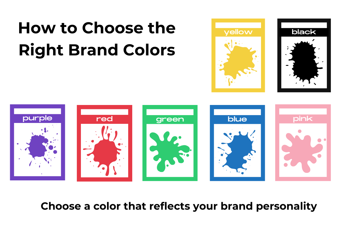
1. Understand Color Psychology
Different colors create different emotions:
- Blue → Trust, professionalism, calm
- Green → Health, wellness, eco
- Red → Energy, urgency, passion
- Purple → Luxury, creativity
- Black → Premium, elegance
- Yellow → Optimism, friendliness
- Pink → Softness, feminine, comfort
Your brand color should match the emotion you want customers to feel.
2. Know Your Audience
Ask yourself:
- Who am I trying to attract?
- What do they value?
- What emotions do I want them to feel?
A spa uses soft neutrals.
A tech brand uses blues and blacks.
A kids’ brand uses bright colors.
3. Study Your Competitors
You need to stand out—not blend in.
Check what colors your competitors use and choose shades that differentiate you.
4. Match Colors With Your Brand Personality
Is your brand:
- Minimalistic? → Neutrals, blacks, soft tones
- Bold? → Bright, high-contrast colors
- Elegant? → Golds, blacks, deep purples
- Playful? → Vibrant and warm tones
Your color palette must reflect your identity.
5. Build a Consistent Color Palette
A good color palette includes:
- 1 primary color
- 2 secondary colors
- 2–3 accent or supporting colors
- Neutral background shades
Consistency builds recognition. Recognition builds trust.
6. Ensure Accessibility
Make sure:
- Text is readable
- Buttons have contrast
- Colorblind users can understand your visuals
Accessibility improves user experience and professional credibility.
Conclusion
Choosing the right brand colors is not just a design choice—it’s a strategic decision. The perfect color palette tells your story, attracts the right audience, and gives your business a strong identity.